
JCAP – Visual signature for a world-class brand with interactive animation
WHAT WE DID
Brand identity, web design, animations, technical implementation
PLATFORM
WordPress
About the client
JCAP is a modern asset management and investment company. Their investment philosophy applies geometric compounding and disciplined risk management, while utilizing cutting-edge technology.
JCAP is located in Hong Kong. It is the investment platform of Jebsen Group, which was founded in 1895.
About cooperation
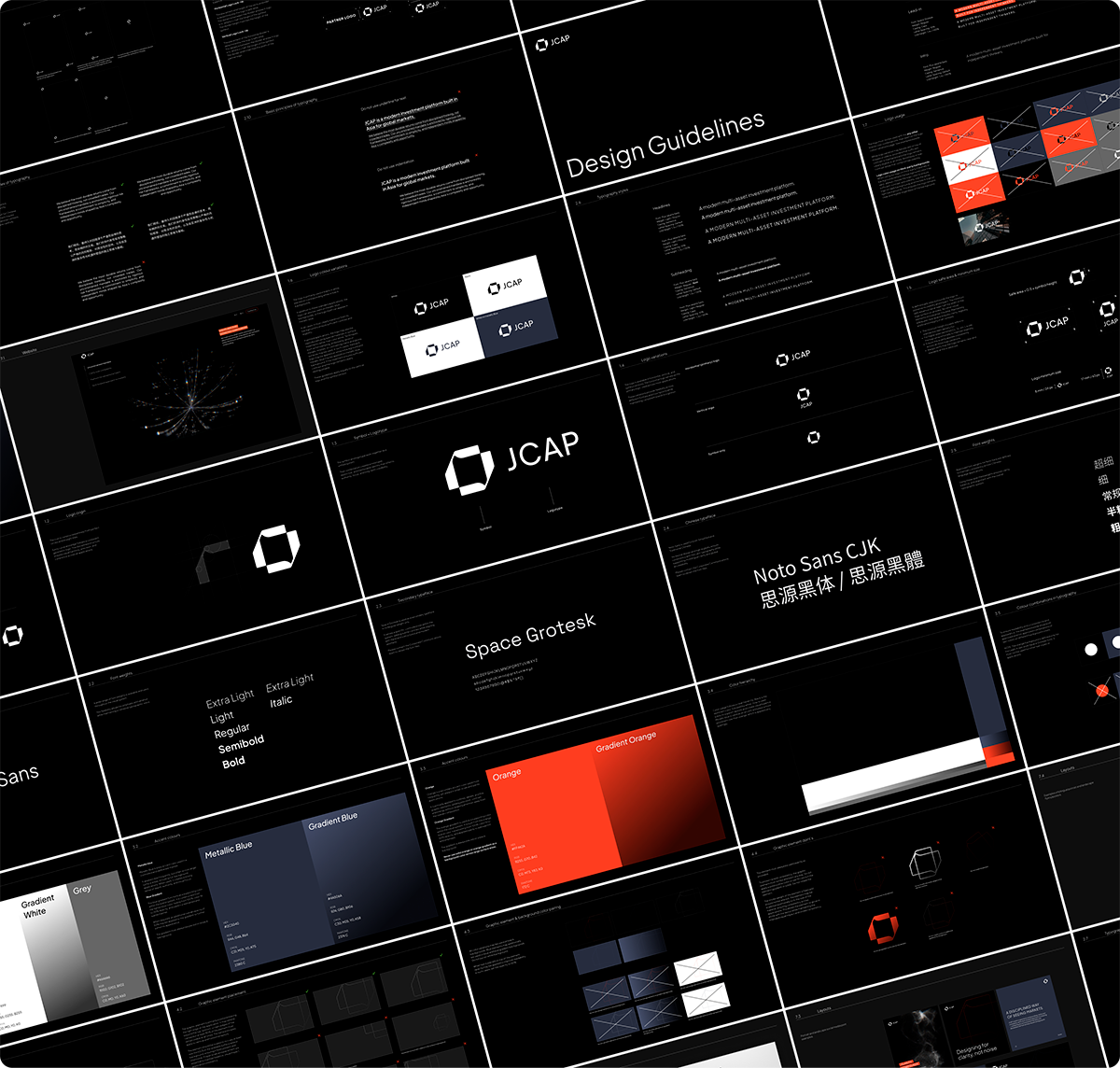
JCAP was looking to renew their brand identity, to reflect its evolution as a global investment platform, with a distinct look and feel of its own. Our cooperation kickstarted with positioning and brand strategy. The result was a fresh and unique look for JCAP, as well as value pillars upon which the website would be built.
The website renewal focused on simplicity but no mere calling card site would do. The new JCAP website would need to impress and inspire confidence with stunning visuals and resonating messaging in a way that reflects their modern brand identity.
BRAND REWORK
A successful strategic foundation ensures a successful and swift implementation
The strategy phase began with an audit on the existing brand, paired with a competitor analysis. The positioning and brand rework established a strong and distinct JCAP identity.
JCAP uniqueness is built on four value pillars: unconstrained mandate, intellectual honesty, a platform for exceptional talent and a tech-forward approach.
The client also received all the rebranded marketing materials they needed as well as a training session on the new brand identity.
“This rebrand captures exactly who we are now – sharp, disciplined, and built for what’s next.”
James Westwood
Chief Investment Officer, JCAP
DESIGN
How to capture world-class expertise with visuals
The website’s focus was not to be on detailed sales argumentation but rather on elegant and simple statements and above visuality that makes a lasting impression.
JCAP is a modern investment firm that applies modern technology in asset management. Based on this theme, we set out to create visuals that would communicate this abstract line of business.
We wanted to avoid the usual clichés of finance and banking, with numbers and growth charts. The main element of the website front page is an interactive animation derived from the company logo. The color palette is dark, black and white with orange highlights.
The abstract animations also accompany the presentation of JCAPs value pillars and unique value. Company location and contact are presented in the same elegant style. In addition to the English language version, the website is published in two Chinese language versions.
WEBGL
Interactive animation takes the impact to the next level
The hero element of the JCA front page is a full-size WebGL2 particle animation. It creates a unique first impression while acting as a visual signature of the brand.
The animation draws thousands of freely floating particles on a black canvas. As the page loads, they form the JCAP logo symbol.
The animation reacts to the movement of the mouse pointer: the particles dodge the cursor and then return to their place, creating a living interactive impression. The logo remains in place but always in motion, symbolizing the JCAP investment philosophy.